The average person with no graphic design background and no interest in the nuts and bolts of book publishing probably wouldn’t give my cover much thought the first time they saw it amongst a bunch of other books on their computer screen. But hopefully, they’d be intrigued enough to click on the thumbnail and maybe even decide, right then and there, to buy my book without even reading the description or reviews. One can dream.
When I started this journey, I was in that group. I certainly appreciated good cover design when I saw it, kind of like when I taste a quality wine or instantly love a new song…I know it’s good without stopping to analyze why it’s good. It just is. So it surprised me to learn just how much thought goes into a cover behind the scenes.
The process is a lot more streamlined at the professional publishing houses with their rooms full of graphic designers focusing on nothing but cover design all day. But it took this little indie author months to settle on a design I was proud to share with the world. Months of brainstorming, perusing books of similar genres, confabbing with fellow authors, cobbling together my own clunky designs on MS Word, and running countless versions by friends and family.
The decisions along the way were mindboggling, to the point where I’d lay awake at night hoping for a Eureka moment. And the more I mucked around with ideas in my waking hours, the more restless I became at night. Eventually, I enlisted the help of a graphic designer to help me focus. We worked through maybe two dozen ideas before finally locking down a cover concept I was excited about. The funny thing? It was my own. I must have inherently known the vibe of my own story and what the cover needed to convey, and with my designer’s guidance, that Eureka moment finally came.
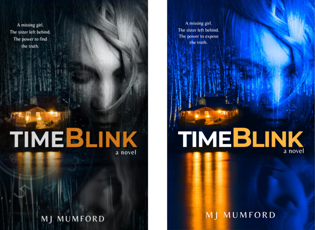
Here’s a look at my rough concept compared to the slick, professionally designed version that my designer created. He advised boosting the blue and the orange to better fit my genre and to flip the image of the young girl at the bottom to match the lighting rather than the placement of the hair.
And look at how he made the trees glow behind the cabin! How did he do that?

As I said, though, it was a long slog to the finish line. There was so much to think about beyond what images to use. There were the fonts to consider, the colors, and intangible matters such as the mood and tone.
At several points along the way, I even changed the title of my book, which was originally 4:44 (or Four Forty-Four depending on what design was being considered that day). I learned that having a number as your book’s title ain’t that pretty, not to mention hard to find in a Google search. Armed with those revelations, for a brief stint I thought Our Tiny World of Here was a good title—it is, but more for a work of literary fiction than a domestic thriller with a time-travel twist such as mine.
As a side note, I also considered TimeSlide as a title, named after the original mechanism of time travel in my book (as in Syd’s timeslide to 1999 was fraught with disaster) until some sleuthing on the internet turned up a crowded lineup of other books bearing the same title. It was then that I decided to change any mention of timesliding in my book to timeblinking, and I think I’ve ended up with a better story for the effort. But that’s for the reader to decide.
I digress. We were talking about cover design.
Throughout the whole process, there were so many great concepts put together, but none of the designs really spoke to me. None of them got into my soul as the final one did. It was obvious I had a winner on my hands when—months later—I still wasn’t compelled to make any changes to the design (I’m still not!), although the blurb on the back went through countless edits. Fortunately, my designer is blessed with inexhaustible patience and took on every revision without complaint. For his sanity, I’ve vowed to be more focused next time.
Next time? Yes, I’m really going to do this all over again, and I can’t wait for the challenge. The beauty of writing a sequel is that its cover design is already somewhat set in stone if there’s any hope of continuity, that is. The fun part will be in finding the perfect images and making sure the mood is just right.
Speaking of fun, if you’re an author, did you know that you can create beautiful 3D renditions of your finished product, like the one at the top of this post? For free? My mentor got me onto a wicked 3D cover creator, https://diybookcovers.com/3Dmockups/, and as you can see in the header image at the top of this post, it’s a handy tool for authors to have.
As for my next book’s cover, I’ll be sure to post photos of the design process when I get to that stage and maybe even get readers to vote on their favorite.
In the end, I may have lost some valuable nights’ sleep over this one, but it was worth it. I’m absolutely thrilled with my cover, and I hope you are too. Visit my Books page for details about how to get a copy of TimeBlink for yourself.
